
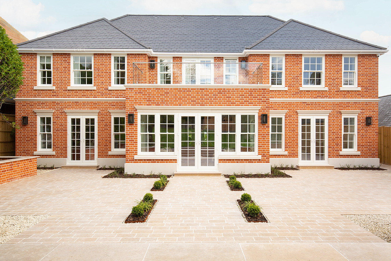
Set within a Georgian-inspired framework and loosely modelled on the Home Alone house, Alexandra’s new build honours the elegance of traditional proportions while embracing modern comforts. The full-house project spans the ground floor and several bathrooms, with every tile and finish chosen to complement the home’s architecture. The result is a residence that is timeless, refined, and full of character, reflecting both heritage and personal style. Every room showcases her love of classic design, artisanal touches, and thoughtful layering, resulting in a home that feels welcoming, curated, and entirely her own.
What is the history of your property?
We originally bought the house with the intention of extending it. Our architect asked us to put together a wish list of everything we wanted, and after some time came back to us saying that the only wall likely to remain would be the front one. Taking their advice, we chose to demolish the existing property and build a new, much more energy-efficient home in its place.
When did your project start and how long has it taken?
Work began in July 2024 with the demolition of the previous home and continued for 12 months.
What styles did you want to see in your renovation?
Architecturally, the house is Georgian, but for the interiors we’ve chosen classic, timeless finishes - something elegant and enduring rather than trend-led. Our original vision was loosely inspired by the Home Alone house. We’ve kept to traditional elements like stonework, sash windows and a large timber front door, while inside we wanted a double-height hallway and a classic, refined design.
Why did you choose Quorn Stone for your tiles?
We chose Quorn Stone because we wanted tiles that would stand the test of time in both style and quality. Their collections offered the classic, elegant look we had envisioned, with beautiful finishes that feel distinctive without being overwhelming.
Beyond the product itself, the guidance and service we received gave us real confidence in our choices. The sample service was also invaluable for creating mood boards and making sure the colours worked together across different rooms. We visited the Surrey showroom several times and always had great support from Luke during our appointments. And with build costs in mind, finding a product that offered both quality and fairness in price was just as important.
How did you discover Quorn Stone?
I first came across Quorn Stone while researching online for tile showrooms within driving distance. It quickly became clear that seeing the tiles in person was the only way to be certain about what would work in our home, so visiting the showroom was an important step in the process.
What inspired you to make your tile choices?
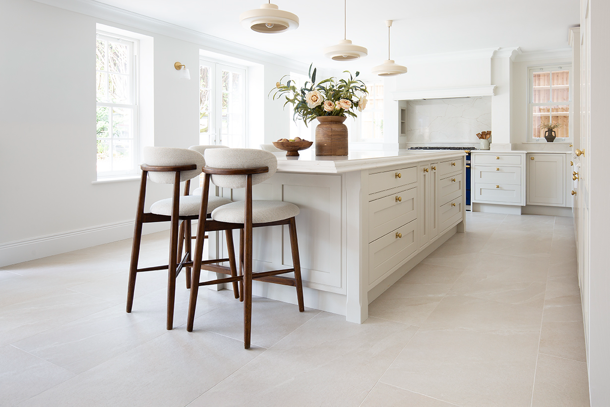
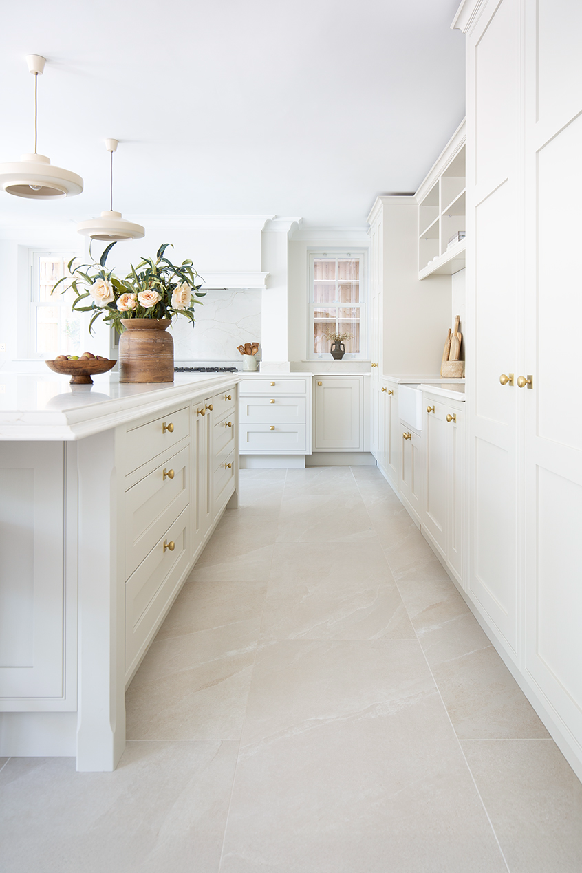
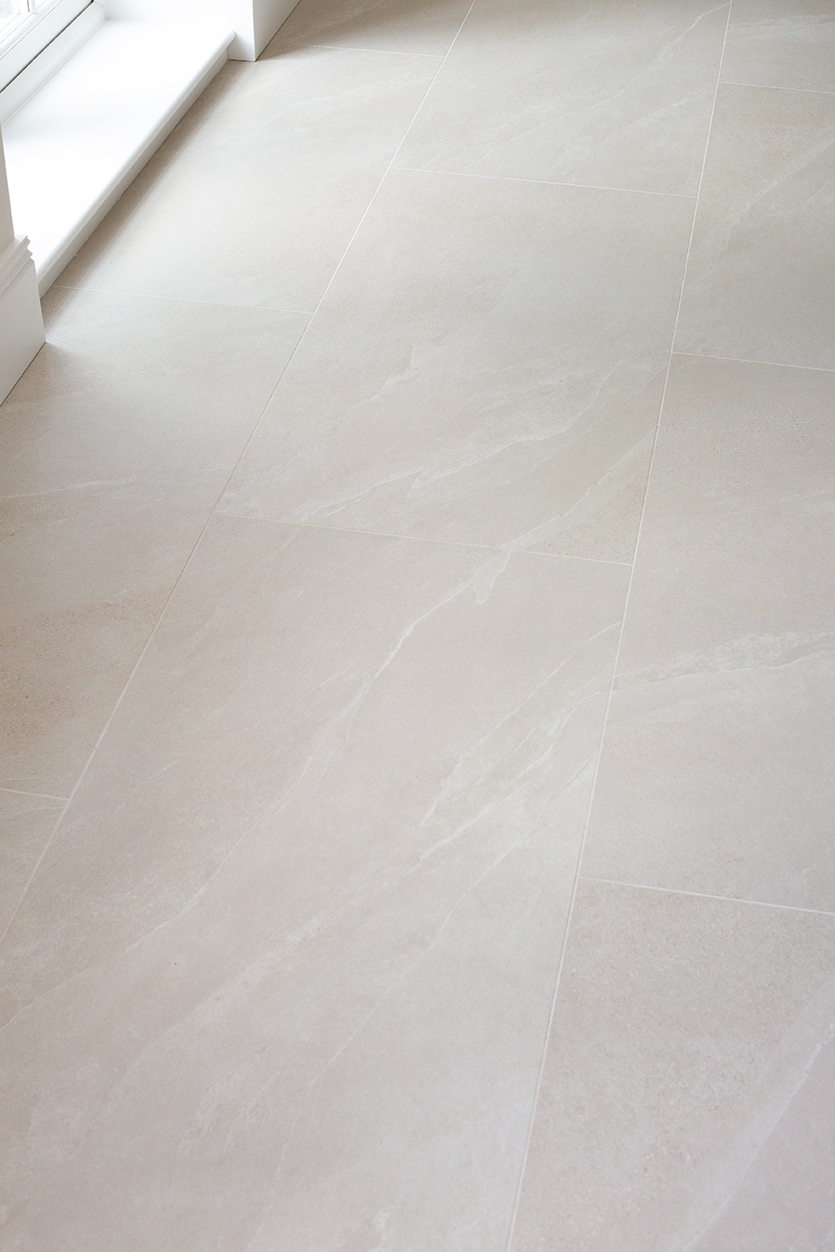
I spent a lot of time refining the vision for each room - I wanted spaces that feel welcoming and elegant, with each area having a sense of presence. Below are tile choices that embody that balance in each bathroom and living space:
Arlington Light Mist
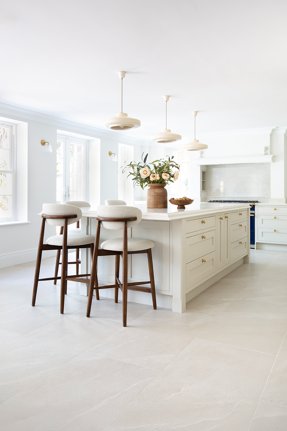
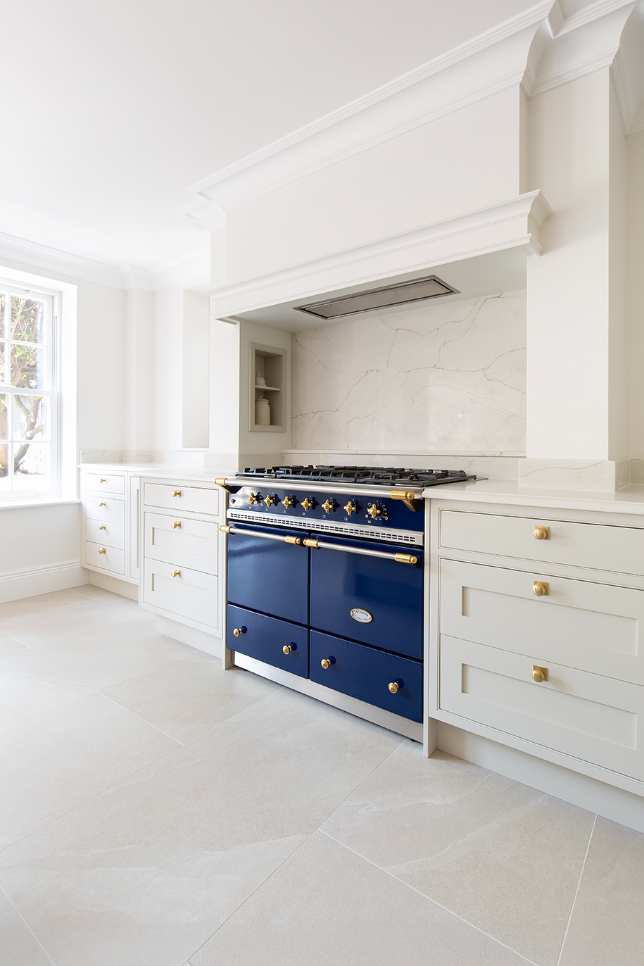
We chose Arlington Light Mist across most of the ground floor, using it in the entrance hall, kitchen, orangery, dining area, and utility. I wanted our main living areas to feel classic yet still warm and welcoming, and this tile strikes that balance beautifully. Its soft hues and delicate stone-like finish add warmth without heaviness, creating an elegant flow that ties all the spaces together.
Studland Ivory
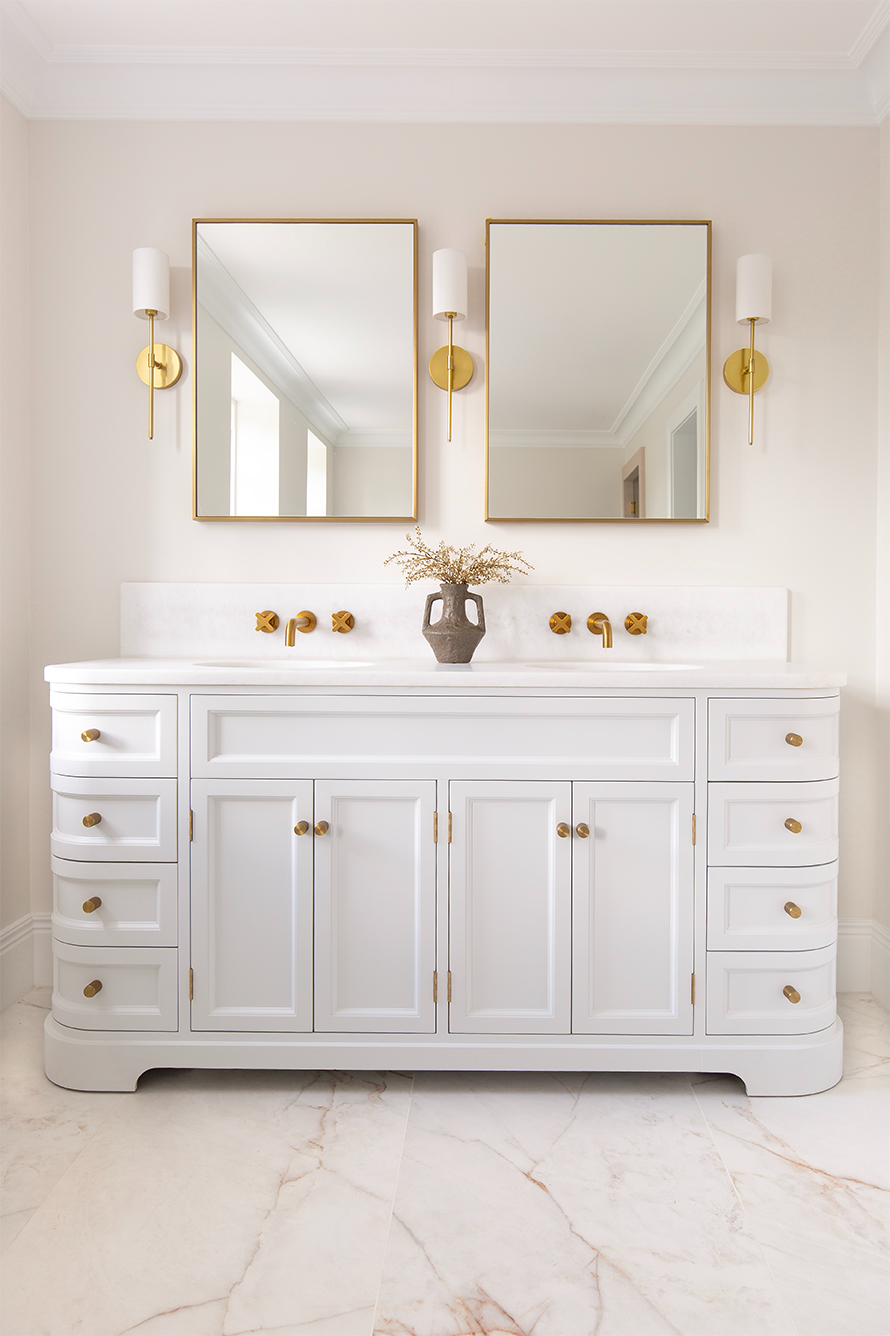
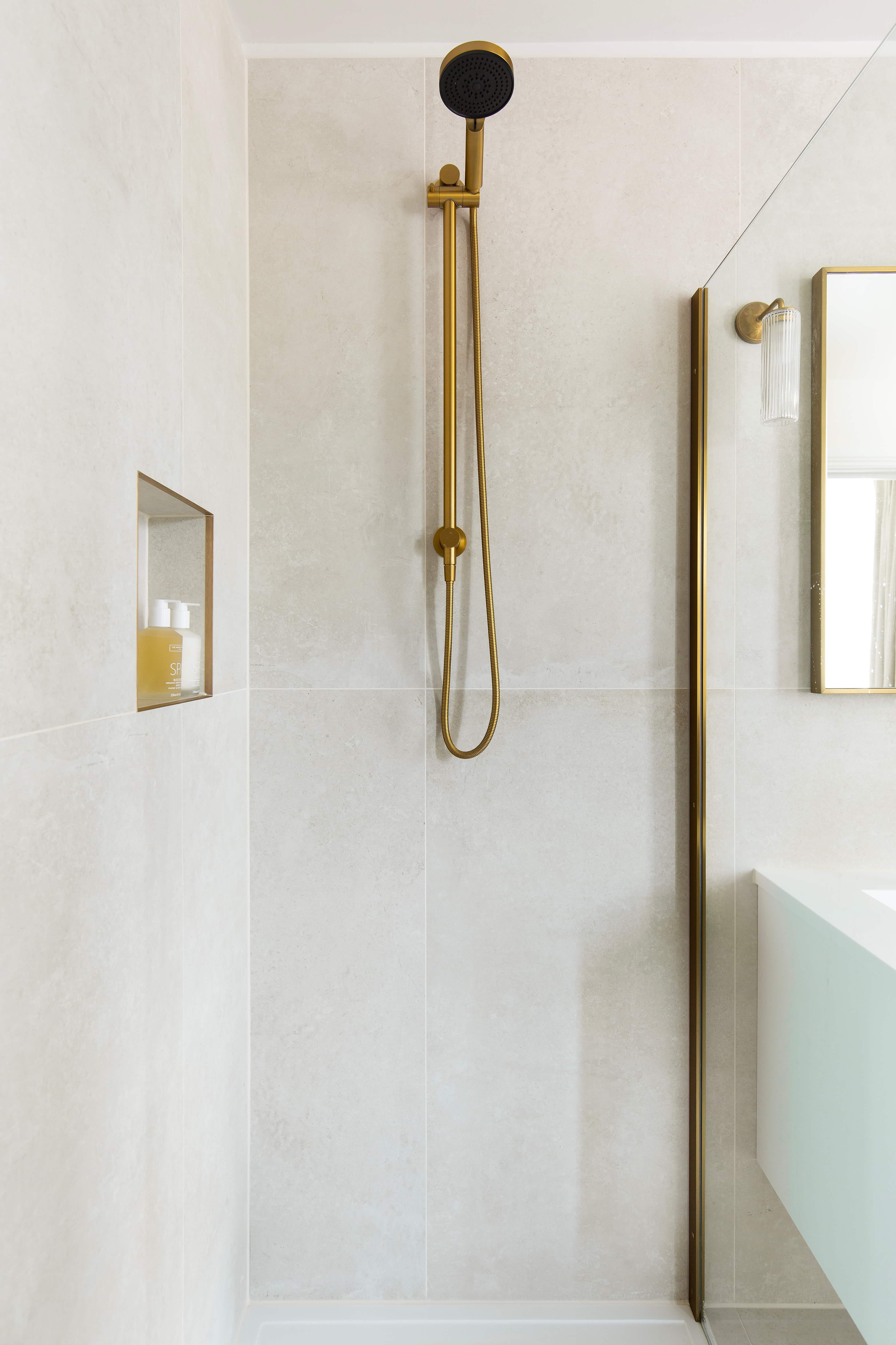
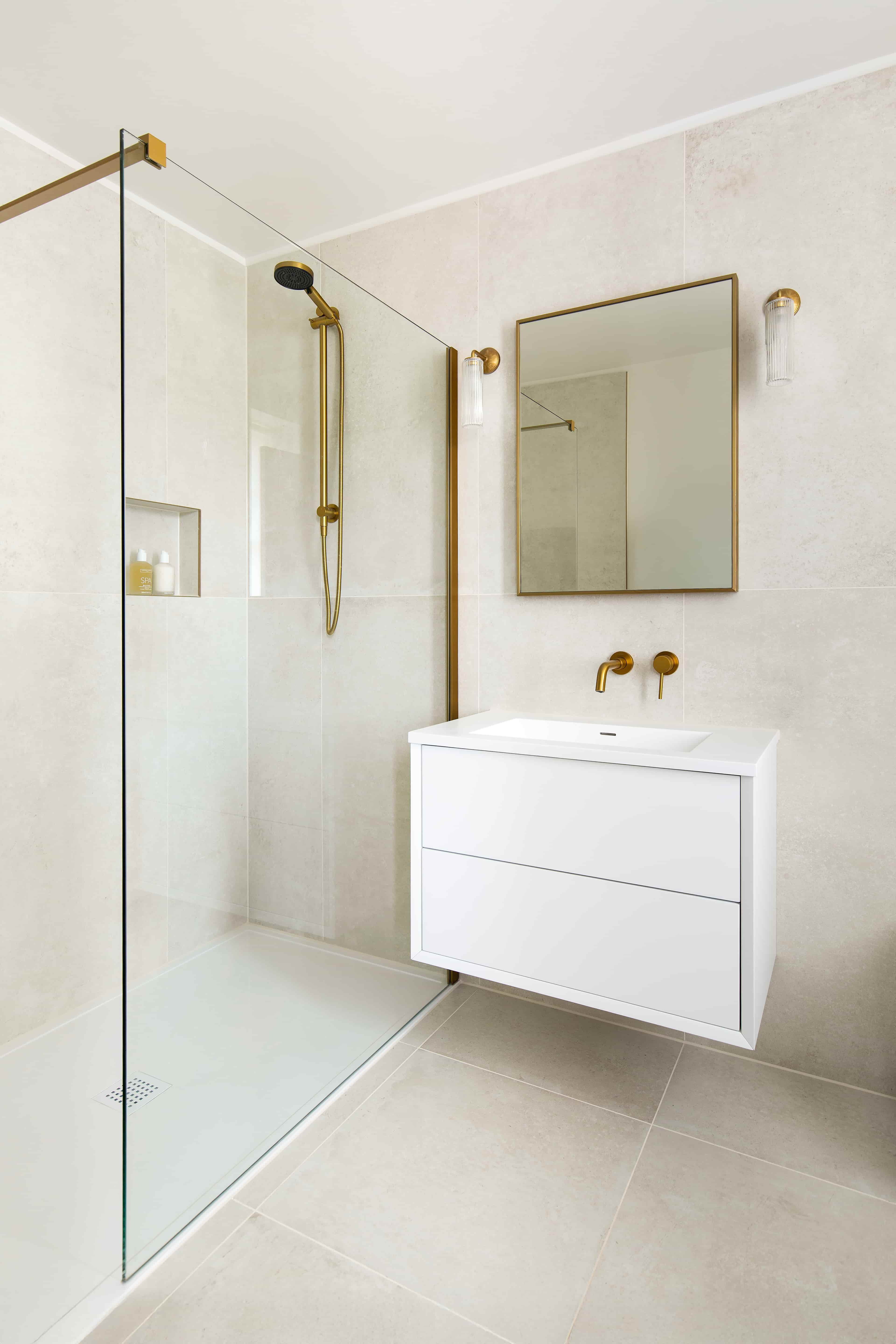
In the children’s bathrooms, we used Studland Ivory to keep the scheme consistent across both spaces. Its soft neutrality and subtle detailing make it a timeless choice that will never feel dated. The matt finish gives it a calm, understated presence, while brushed gold fittings bring warmth and a gentle touch of luxury to the scheme.
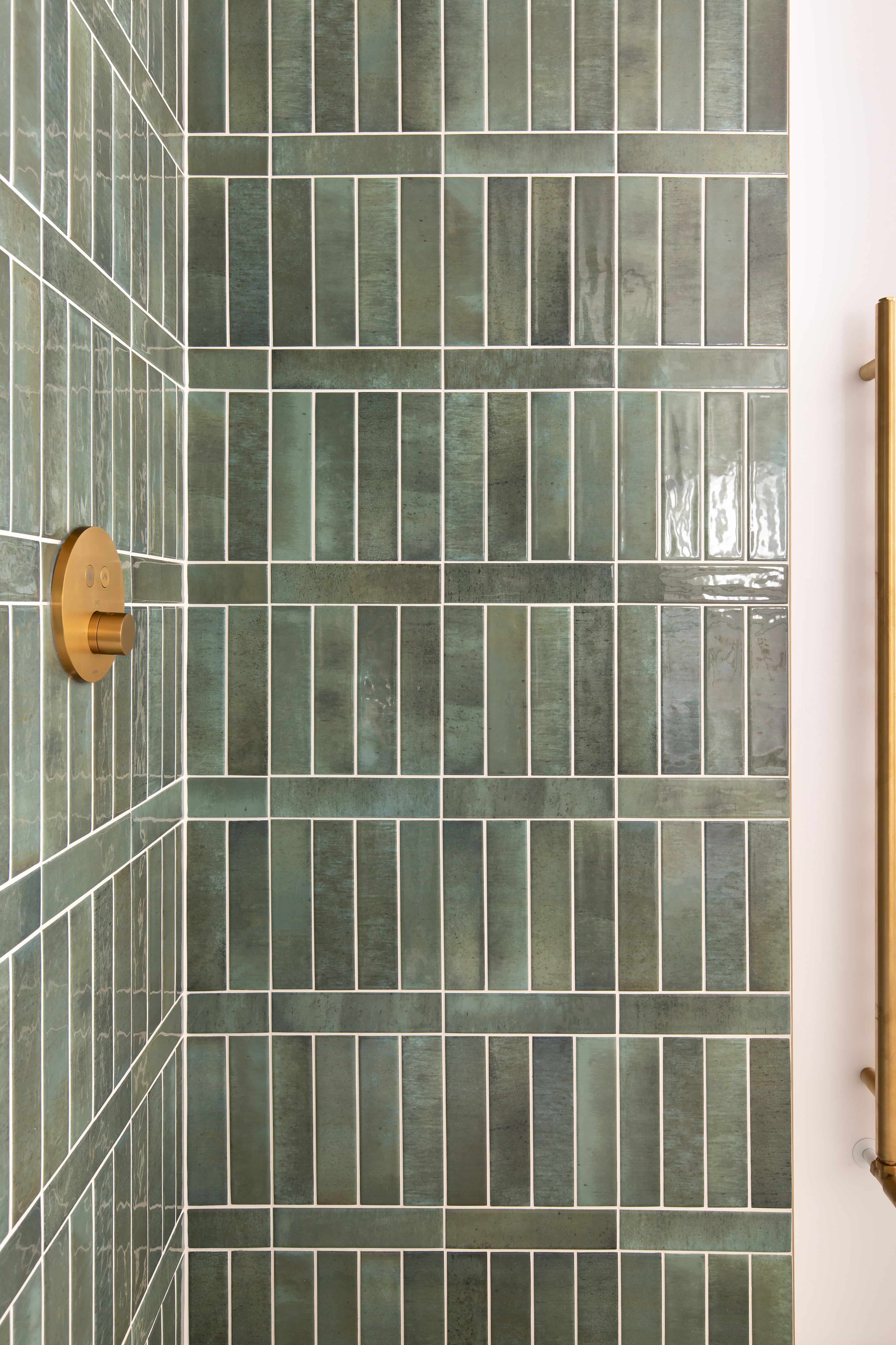
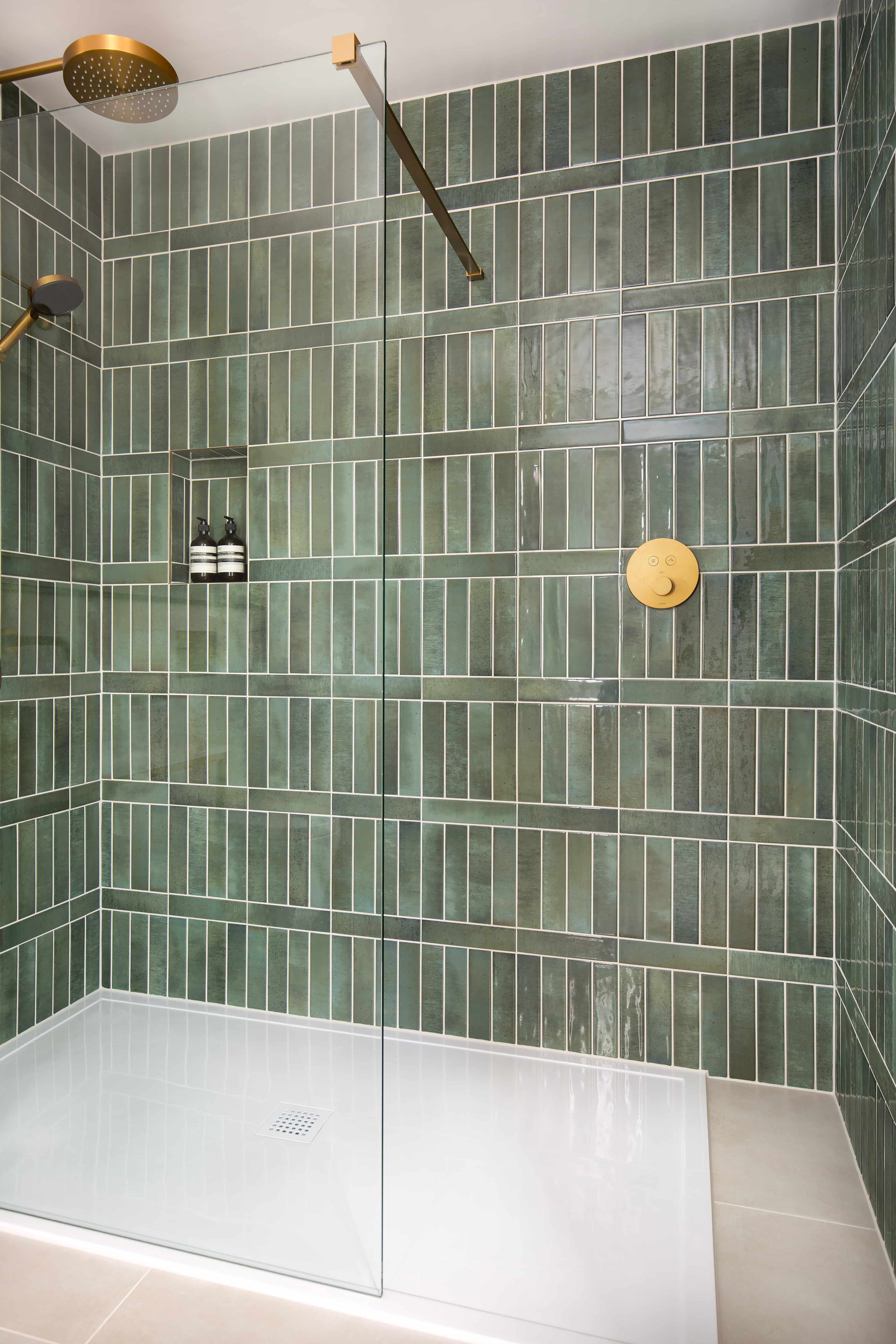
Nori Forest
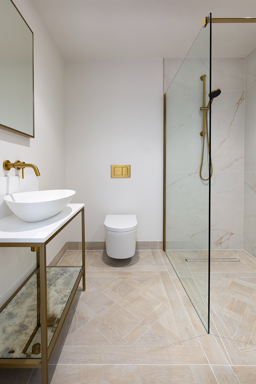
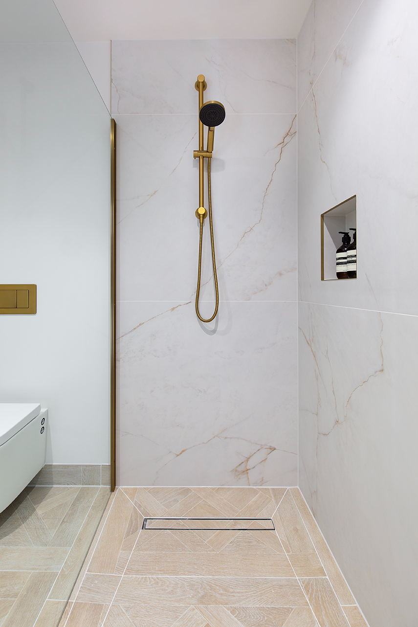
For the guest bathroom, we wanted to create a space that felt indulgent. Nori Forest’s rich green undertones provide depth, and its varied tones keep it from feeling flat. Paired with brushed gold fittings, the look has a sense of opulence, giving guests a special experience when they visit. Our aim was for the space to feel more like a hotel bathroom - somewhere a little spoiling, memorable, and different from the everyday.
Carrara Rosa
In the master en-suite, I wanted something softer and more romantic. Carrara Rosa, with its delicate blush veining, felt perfect. It introduces character gently, without overwhelming the space. Paired with micro-cement walls in Farrow & Ball Scallop and crisp white fittings, it creates a serene, refined retreat - calm, graceful, and subtly elegant.
Alderton Birch
We also chose the Alderton Birch tiles for our office en-suite. Since this space is primarily used by my husband, we wanted it to lean slightly more rustic and masculine. These wood-effect porcelain tiles were the perfect choice - bringing the warmth and character of natural timber with all the practicality and ease of porcelain.
What is your must have gadget in your renovated area?
Our must-have gadgets are the boiling water tap, the charging drawer, and the appliance garage. The tap is used constantly and makes life so much easier, while the charging drawer keeps all those everyday devices hidden away. The appliance garage is another favourite - it means the worktops stay clear, but everything we need is still within easy reach.
What is your favourite interior piece and why?
It’s hard to choose just one favourite piece because we’ve been able to do some really special things in this house - one of the joys of starting from scratch. In the kitchen, I was very spoilt with our deep navy Le Canche range cooker, which is as much a showpiece as it is a pleasure to cook on. But if I had to choose, I’d say my favourite interior pieces are those created by independent designers - like our commissioned lobster painting and Mediterranean mini tile paintings by Pippa Smith, which sit in our kitchen and above our oven, and the handmade ceramic lights by Portuguese designer Patricia Lobo of Lobo Atelier. We wanted the kitchen to have a Mediterranean feel, and these details bring such personality and artistry into the space. I love being surrounded by artisan pieces that carry the touch of the maker and a sense of originality.
What was the best bargain find during your project?
What was the most difficult part of your renovation process?
Staying away! Our rental property was only 0.6 miles away, so we would pass the house almost daily. That meant we were always catching little updates rather than seeing the big leaps of progress, which made it harder to appreciate just how much was being achieved. Our contractor, MSP Details were exceptional - the project was delivered with such efficiency, professionalism, and attention to detail that we could hardly keep up.
Where do you like to shop for interior pieces?
I like to find pieces that aren’t the norm and to support small businesses that really specialise in their craft. I generally avoided the larger interior companies, instead focusing on finding the pieces I truly loved and then searching out the best prices. For example, we discovered Leverint Lighting on Instagram and chose one of their chandeliers for our entrance hall after hours of refining exactly what we were looking for. Instagram and Pinterest were invaluable sources of inspiration, but I also loved the old-fashioned process of tearing pages out of interior and home magazines to help refine my likes and dislikes.
What 3 words would you use to summarise your style?
Classic, Inviting, Artisanal
Project Details…
Kitchen – Hamilton Stone Design
Kitchen Island Colour – Hamilton Stone Design (Shell)
Kitchen Unit Colour – Hamilton Stone Design (Shell)
Wall Colour – Little Greene Slaked Lime
Lighting – LOBO Atelier (island) & Corston (wall)
Bar Stools – Lush Interiors – Arne Walnut
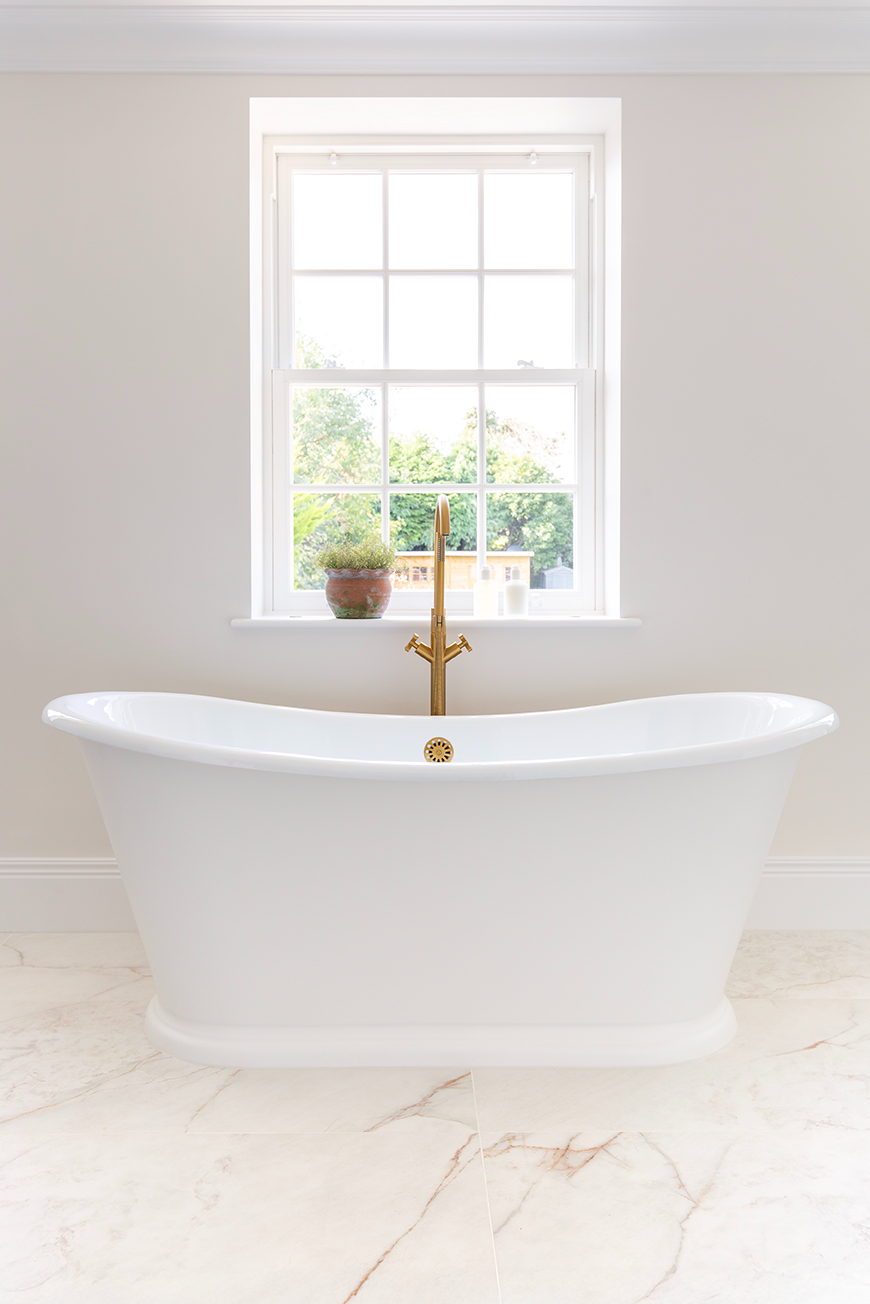
Bathroom – Porter Bathrooms
Wall Colour – Little Greene Slaked Lime
Lighting – Andrew Martin


